|
|
|
Payday Loan Blog - Design
|
| |
Even though we’ve hit some snags, we’re hoping to launch a brand spankin’ new Payday Loan Affiliate by the end of Q1 2007. The current design is a little busy and to be quite honest I don’t think we ever intended it to go as far as it did in the SERPs, which is why this quirky little-website-that-could was allowed in the first place.
With that said, what should a webmaster expect when redesigning a website? As luck would have it, I have a few suggestions…
Rule One: Design for Your Primary Consumer
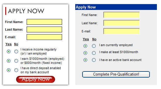
Once upon a time Payday Loan Affiliate was launched with one intention – help our clients make money. As time passed links, blog posts, and other marketing efforts began to pile up and wouldn’t you know it… we now have a growing audience of payday loan clients to serve. Our original index page is too confusing for a payday loan client (the keep it simple rule most definitely applies in this industry) so it turns out we are hemorrhaging potential revenue big time.
This new redesign is now more geared toward a payday loan client, and relies on our savvy affiliates to do a little more digging in order to find the information that pertains to them. Is this okay? Sure! It’s just the hazard of serving two masters, but the key is to understand how each one thinks. Payday loan clients have little patience for content that doesn’t immediately pertain to them, whereas your typical business development person is more likely to search around a bit. Here are some previews of the soon-to-be design:
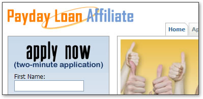
The payday loan application form is prominent and immediately visible.
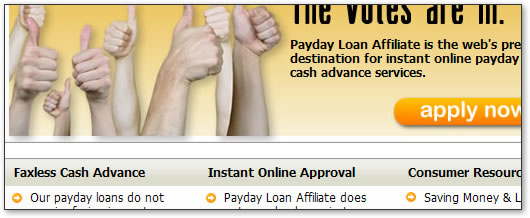
The first round of content is relevant to the group of people who are the most likely to balk.

Site navigation breaks down your primary functions, again in the order of most sensitive to least.
Rule Two: Keep Your Text as Constant as Possible
You might be tempted to change your text around a bit, but this urge must be controlled as tightly as possible. Too much change will set off a search engine, no question… so leave your keyword density intact if at all possible. Instead, phase in copy changes over a couple of months and let the spiders adjust over time.
Rule Three: Clean Out the Junk
Most websites have a lot of little tiny junk pages that accumulate over time. Failed experiments. Lost initiatives. Example pages. Unused comps.
Get rid of it all!
These pages, images, and miscellaneous others have the habit of showing up when a new look is rolled out, so I suggest being proactive by going through each file to ensure a nice & clean file structure.
Rule Four: Redirect Dead Pages
If you do go on a massive cleanup spree, be sure to use your 301 redirects where appropriate. One of the unintended side effects of a redesign is the sudden disappearance of old content, so it’s important that these old pages are accounted for somehow. You never know who might have been linking to them, so take advantage of that link juice and 301 it to a relevant location!
Rule Five: Site Command, Site Command, Site Command
Keep an eye on your website using the site command relatively often. I usually take inventory of what each of the Big 3 thinks of my site pre and post, comparing and contrasting page positions, descriptions displayed, and most importantly the pages that disappear. If they did disappear, I check to see that they are being linked to or 301ed, depending on my intention.
It usually takes a month or two for the site command to fully make sense of your new design, so don’t stress out if it’s only been a week and it looks like everything went to hell!
Rule Six: Expect Downtime
Always, always, always plan on downtime when posting a redesign, no matter what. You will likely see your site disappear from the search results for a bit, so it stands to reason that you ought to post a redesign during an off season. Summer usually works best for payday loans, since that is when traffic tends to be at its slowest, so keep your industry’s traffic patterns in mind before you go through with any material changes!
- Blumey
…but blogging with images is a pain in the #$%!
Though I’m quite sure Cygnus is the more interesting blogger to most of the Payday Loan Affiliate Network subscribers, his attentions are elsewhere today and you’re stuck with me. Cygnus forwarded me a question posted on the Payday Loan Affiliate Marketing Blog profile which is today’s topic – big images can equal big trouble!
We’ve really hammered home one of 2003’s most played out phrases – content is king. Well, the shift in focus from regular SEO methods has sent most of your garden-variety webmasters out there in search of places to rip content for use on their own websites. Their salvation has manifested itself in the form of one symbol – sort of like what happened to Prince, sans the salvation part – and that symbol is:

RSS feeds, much like the one available through this blog, give webmasters the unique opportunity to keep their clients up-to-date with the latest goings on in their little corner of cyberspace. This is great news for people like Kimberly of Your Credit Network who manage a personal finance blog; an RSS feed allows for instant delivery of content to a subscription-based readership – but what happens when an RSS feed needs to be toned down because everyone and their mom is using it to suit their own purposes?
The Problem: Gargantor Images in RSS Feeds
First, let’s state some assumptions based on a preliminary analysis of Kimberly’s site:
- She manages a blog with an ATOM or RSS feed
- People are using the content provided via her RSS feed as a supplement to their own content
- Kimberly approves of this and want to help out by making sure any artifacts provided in her feed do not break her subscriber’s page
The Your Credit Network blog has a number of publishers, and an example of where a recent post was syndicated can be found at the LoanSaver credit card blog summary. As you can see, Kimberly’s most recent post about fixing up credit scores had an image that was far too large to fit the area allotted for it, even though this image fit just fine in her own blog.
The Solution: Communication!
There are some JavaScript solutions for automatically resizing images based on a user’s window size , but this presents a problem since the security on any kind of JavaScript has really been turned up on recent browser upgrades. Alternatively, Kimberly may choose to communicate with the webmasters who use her content and develop a set of standards that meet their criteria for syndication. In the case of the LoanSaver group, a cursory examination of their CSS file shows that their maximum width for the column holding the feed is 385px; therefore, if Kimberly wants to continue to provide content to this publisher she ought to keep her images below that width (the image she uses for the tree is 490px wide in this case!)
It's also important to make sure you use absolute addressing instead of relative addressing - content hosted on another website will not be able to display your images otherwise!
Why is this Important?
RSS feeds provide publishers with fresh content updated by experts. They also provide free back links to interior pages and other relevant resources to the blog that produces the content. In both cases the situation is win-win for the webmaster, so it only makes sense that the two would work together to make sure that each webmaster’s needs are being met. We keep a list of acceptable image sizes here at the Payday Loan Affiliate Network, so on the rare occasion that I do design creative for use in a blog post I know it won’t be messing up any of our syndicating partners’ websites. The things we do for quality back links, eh?
- Blumey
One of the things that separate a good web design from a great web design is the appropriate use of whitespace throughout a site. Not only is the use of this particular element visually pleasing, it also helps your visitors easily identify which items they should pay attention to and where to go when they are ready to apply for a payday loan.
So… What is Whitespace Anyhow?
Whitespace is somewhat of a misnomer, since it technically doesn’t have to be white at all. Take the current rendition of Payday Loan Affiliate for example – the left and right margins are a deep blue color, so if I wanted to go and add more content it would be wise for me to increase the spacing between the elements by adding more blue space in between the objects/text/whatever I’m adding. This helps to avoid a cramped feeling that can result from the would-be information overload that occurs from having too much text in one place.
Now that we understand that whitespace doesn’t necessarily have to be white, I’m going to start calling it negative space – a lesser-known but far more accurate synonym for this design element. Negative space is just the base color of your document or of the area in which you are working; a good example would be the margins which are blue and would require more blue between items for negative space vs. the man blog area which is white and would require more white between elements.
Some Negative Space Examples
One of the genres of website that bugs me the most for egregious non-use of negative space is that of real estate. Webmasters have long used the same three templates to put together a site, which is all well and good but are they making the most of their space? Here are some examples, good and bad…
Good Examples
- Coldwell Banker – various background colors with lots of space around each. A client can immediately identify the actions required of them with just one glance.
- Century21 - I like what they’ve done here given their color scheme of brown, gold and more gold. They’ve separated their visitors into two categories with a bold color (people searching and people who have already found a property/are registered users); they then balanced out the “heaviness” of the top of the page with a nice gold fade-out at the bottom, using lots of space between the text so as not to overuse the color and allow for readability.
Could Use Improvement…
- Realtor.com – Graphics are really close to one another and the sea of links toward the bottom of the page makes my eyes gloss over.
- Remax - This is one of those situations where whitespace should actually mean white space. The use of blue and red primary colors (more on color) increases the contrast but is also a little hard on the eyes. Changing the search area to a white-based background would provide a shelter from these otherwise intense colors and would help direct attention to the search feature on the page.
Now let’s take a look at different ways of framing objects and text using color and negative space in concert. Here are three examples of the same cash advance image that use varying levels/types of negative space:

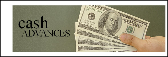
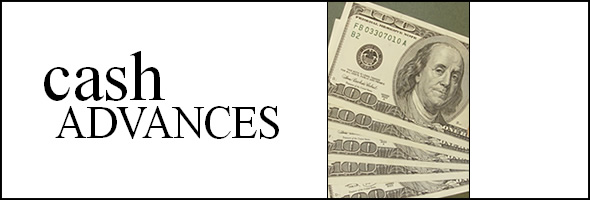
The first image makes little change to the original background graphic, but as you can see the strength of “cash advance” seems to get lost since there isn’t enough variance in the image to call attention to it. The second image uses a bit of white to frame the graphic in a non-symmetrical fashion; this causes the viewer to focus on the image and in doing so the cash advance phrase. This works, but it’s still a tad dark for my taste. The third and final graphic uses white to isolate the two main themes of the image – the phrase “cash advances” and the picture of money. This is bold and to the point, but most importantly nothing gets washed out and the purpose/message of the graphic is loud and clear.
Related Reading:
- Blumey
Happy New Year to all of our readers – 2006 was definitely a year of transition for those of you heavily entrenched in the SEO side of things, but that’s par for the course as I understand it. The biggest change, in my opinion at least, came in the form of web design methods and the “all aboard” mentality that the wave of social networking sites created. Web destinations such as Myspace, Wikipedia, YouTube, and countless others either exploded onto the scene or continued to grow in ways that boggled the minds of many webmasters out there (myself included). The content offered by these sites made each of them famous in their own right – but their designs made them distinct, and I think everyone will agree that these sites have certainly moved the goalpost that defines the cutting edge in design methodology.
Welcome to Web 2.0
At the risk of sounding like a sell-out or one of those trendy bloggers out there who latches onto an idea just for the sake of uttering a buzzword in the process, welcome to Web 2.0. While we at the Payday Loan Affiliate Network may offer up tons of advice about SEO, content management, scripting techniques and all that other nerdy stuff, we’ve been largely silent on the issue of web design as it relates to this Web 2.0 bit. That’s my bad – but I’ve been working on a way to adequately describe it in a fashion that relates to our payday loan clientele. Consider this my mea culpa.
The truth is Web 2.0 centers around this idea of community building and letting the masses e-congregate for the purpose of promoting favorites of the whole to the top and creating buzz around new/improved/trendy bits; this goes against the grain of what must logically be called Web 1.0, which in its purest form is basically just push marketing where search engines act as the retailer to your wholesaler role (as far as cash advances are concerned anyhow). What we have left is this weird place where we’re not really using push marketing nor pull marketing to create this much sought-after buzz, but instead a new concept which I’m going to call poll marketing – that is, the popularity of products based on the polling of users within a given community.
What does this mean in a payday loan context? Well, the days of the one-sided communiqué from payday loan provider to payday loan consumer are long gone; we must now live with the consequences of a client’s ability to detail their good or bad experience in their own personal blog – a force that has proven itself time and again. I’ll be covering more about buzz tactics and the like later, but keep in mind that a simple user interface and basic design are the unsung heroes of the Web 2.0 effort.
What Makes a Design Web 2.0-ey?
Big text. White space. Sans-serif. Bold colors. Popularity clouds. These elements all play integral roles in the creation of a fluffy site that lends itself to consumer usability, and if you’re brave enough to create a community concept behind a cash advance product then these things are what you’d use to visually identify your site as a next-generation destination. Content and design must work together to programmatically and visually send messages to consumers that your site is the cutting-edge place for a person to get the cash they need. I’m working with a couple sites to get this look up and running so I’ll have examples later on, but in the mean time here’s a list of some other non-payday loan sites for you to look at and perhaps use as inspiration for a face lift on your own web property:
As the web continues to evolve into something more interactive and user-friendly, it’s imperative that your design reflect such a movement lest you get left in the dust of your competition. Take a look at some of these sites and see if you can’t come up with something edgy or poppy to catch your clients’ interest – Web 2.0 is where it’s at.
Related Resources:
- Blumey
Don't repeat your mistakes. If you create new sites by first copying your old ones, you need to make sure you don't copy the mistakes too. As Blumey and I work with site designs, we occasionally encounter problems. I then fix them, and expect that future designs won't have that problem. Of course, it doesn't always work that way. Since Blumey's a designer, he starts with a vague idea of how he wants a site to look and sometimes a past design fits that idea. He'll then copy that site's code to modify. That's a great way to speed up the site design process. Unfortunately, sometimes he'll copy old designs that have the problems that were already fixed, and then he'll tell me it's broken. A typical exchange:
Blumey: "Jooon, this payday loan site is broken."
Jon: "Are you using the current version of the code?"
Blumey: "… Yes."
So I take a look at the site, and it's an old version of the code. I'll fix it and shoot a rubber band at him.
When you copy your old designs for new cash advance sites, make sure you update them with all of the latest fixes, or you'll keep running into the same problems over and over again.
-Jon K.
To be fair to Blumey, when I do site designs, it ends up looking like Timmy from South Park did it.
How to build a short version of the cash advance application form is one of the most common questions we get from affiliates old and new. We’ve finally standardized the form code needed to transfer data from your site to our secure cash advance processing application, so here you go:
<form action="https://www.paydayloanaffiliate.com/Affiliate/App/apply.aspx" method="post" name="frmApply" id="frmApply">
<input name="campaign" type="hidden" id="campaign" value="WEBSITENAME">
<input name="affl_id" type="hidden" id="affl_id" value="12345">
First Name: <input name="q1" type="text" size="15" />
Last Name: <input name="q3" type="text" size="15" />
E-Mail: <input name="q4" type="text" size="15" />
I have a regular source of income.
<input type="checkbox" value="Y" name="q5" checked="checked" />
I receive at least $1000/month.
<input type="checkbox" value="Y" name="q6" checked="checked" />
I have an active bank account.
<input type="checkbox" value="Y" name="q38" checked="checked" />
<input name="Submit" type="Submit">
</form>
This is the most basic form of the code of course, but you may choose to spice it up like some of our affiliates. Here’s an example of two sites that have used the form in different ways:
*special thanks to the folks at Power Payday Loans and Urgent Cash Advance Loans for letting me use them as an example
The form on the right is in use at Power Payday Loans, and as you can see they’ve chosen to make use of more graphical elements such as a fancy submit button and some shaded table elements to make their form pop out; Urgent Cash Advance Loans opted for some CSS mouseover functionality to call attention to their form when the user interacts with their page (I'd recommend visiting each site to get the full effect). Both sites used the same basic code to do something completely different, so I challenge every member of our program to take the code and do their own thing!
Modifying the Code for Your Needs
The only fields that really need to be changed are the two hidden fields up top. Swap out the id=”campaign” with the name of a sub-tracking variable you want to associate with your site and then change the id=”affil_id” to your affiliate ID as provided to you in your initial sign up email. (If you don’t have your ID handy email me and I’ll track it down for you.)
Apart from that you should be good to go – happy lead hunting!
- Blumey
This post will be continuing my post about the use of colors on payday loan sites. Today’s topic is the use (or non-use) of web safe colors when picking graphics, layouts, or even CSS styles for your site – but first we need to answer the larger question…
Are Web Safe Colors Even Necessary?
The short answer is no. The need for a web safe color scheme died about the time better graphics cards and high tech monitors became commonplace in the market on a large scale. It used to be that graphic designers were the only ones with access to these technologies, but no more. Very few people make use of the 216 palette anymore, so it’s more or less safe to abandon the use of a web safe scheme altogether for most audiences.
Who Might Use/Prefer the Web Safe Scheme?
People with older machines or lower-end operating systems are your likely candidates for web safe color preference. Unfortunately this may encompass your average payday loan client (notice I said most audiences) so even though the web safe model is more or less dead, you might want to keep it alive just to be super sure your payday loan customers get the experience you intended (from a color perspective at least).
What are the Advantages/Disadvantages of a Web Safe Scheme?
Web safe colors don’t include the hues/saturations that many artists prefer, which means that your choices are cut from 16.7 millionish to 216 right away. Finding colors and achieving desired shading can be tough, but you’re guaranteed to have the desired outcome for each user, regardless their computer setup. It’s a little tougher to get the 216 colors to work together since they’re more bold, but many artists wear this as a badge of achievement; conversely, many employers see this as a plus (but these are the ones that were designing with 216 colors way back in the day.)
Does it Really Matter Anyhow?
In my opinion, probably not. Payday loan clients aren’t necessarily as discerning as your typical art student. It’s also been my experience that affiliates who write in and ask about the use of web safe colors usually have enough design chutzpah to hold their own with or without web safe colors, so the point might be moot anyhow.
Web Safe Color Resources
- Blumey
Earlier this month JupiterResearch issued a joint press release with Akamai about the effects of page-load time on the customer shopping experience; specifically, they assert that there is a threshold of about 4 seconds that a customer will wait for a page to load before abandoning the process altogether. While this press release is a rather thinly veiled attempt to push one of Akamai’s services out the door, it does serve one critical purpose – a flimsy pretext for me to talk about the importance of load time as it relates to the design of cash advance websites.
One of the major pitfalls of site design is the temptation to use creative everywhere. If you’re a designer like me, you’ve probably gone back and forth with whoever runs your content development about the merits of pretty creative versus the functionality of content, only to yield (as you always should) to content and secretly curse its existence under your breath. (Maybe that’s just me.) Balance is the key to this particular puzzle, if for no other reason than the fact that no client likes things like no fax cash advance, faxless cash advance, cash advance no fax, and any other variation of a targeted keyword phrase thrown at them from all angles in the form of pop-ups or other distracting images. (If you’re offering no fax cash advances to your clients using our system, shame on you! Our cash advance content guidelines specifically state that our cash advances may not be referred to as having a no fax quality associated with them.)
The bottom line is creative slows load time, and as our friends over at Akamai assert this can be a big mistake. I’m assuming we’ve laid the argument for the use of flash graphics to rest in this case, so let’s talk more about creative in terms of good ol’ fashioned static images when trying to get your message about cash advance across.
Rule Number One: Use Images to Highlight Points, NOT Tell Stories
Images should be used as the odd distraction from otherwise boring text (let’s be honest here – people don’t go to cash advance websites to digest the information like they would the Wall Street Journal.) In other words, the main role of an image is to break up mundane text and highlight calls to action. Images that contain too much information will not only dilute the calls to action, but will slow down the load time of a page to an insane degree. We’ve all seen those cash advance sites that are 80% image, 20% text, right? These guys will fall victim to exodus-grade balking if their server takes too long to serve up the images, so crafting short, concise messages in the form of a pretty graphic is the lesson to be learned here.
Rule Number Two: Compression Rates & File Types
Everyone wants their cash advance site to look nice and provide a solid way to brand their offering, but I’ll tell you right now lightly compressed JPEG files are not the solution. Happy faces, attractive models, and (most importantly) endless seas of $100 dollar bills are a great way to get your message about cash advances across visually, but they can spell disaster if they take too long to load. I like to have one graphic in particular that I’ll set for a lower compression rate (quality score of 90-95, depending on the level of detail); I’ll usually set the rest of the images on the page to above-average rates of compression to make up for the difference.
TIP: If a fuzzy JPEG is bothering you, use less text to improve the overall look of the image. Text will de-crisp-ify the higher you set your compression rate, so spend your compression points on the graphic that you want to pop.
I’d also like to point out the under-use of GIF files these days. They’re smaller, faster loading, and with the recent improvements of browsers/image authoring software they retain their color information much better than they have in previous years. My rule of thumb here is everything but photos and things that fade from one color to another gets the GIF format – you can even toy with GIF types such as WebSnap, Adaptive, or the more size-intensive Exact to get your graphic exactly where you’d like it to be visually. (Each of these formats will be smaller than your above-average compression rate JPEG file.)
Rule Number Three: Clean Up Your Code
If you are experiencing troubles getting your load time down, there are still a couple of things you can do to make sure your page loads within those critical four seconds:
- Keep your <body onload="MM_preloadImages('images/whatever1.jpg','images/whatever2.jpg'')"> tag to a minimum (this tag is often used for image swaps and usually comes with a JavaScript that can throw some browsers.) Generally, it’s just a good idea to avoid image swaps if it can be avoided, since cash advance clients aren’t known for being on the cutting edge of technology as far as JavaScript compliance & browser versions are concerned.
- Other forms of JavaScript can be a problem too, especially if you’re relying on content or functionality from another server. Some affiliate programs use JavaScript to control content on their affiliates’ sites, but the servers that house this content can be slow.
- If you’re running a stats program or some other application that sucks up a lot of process time on a page load, consider moving that code to the end of the document so the page will render first or getting rid of it altogether.
- If you’re a fan of tables consider switching to CSS. If you intend to put a lot of text on any one page you’ll need all the space that tables tend to take up, so this switch in programming preference may make all the difference.
- If you use Dreamweaver to create your pages, play with the load time feature in the lower-right hand corner to get an estimate for how long your page will take to load.
I think you’ll find that image use, just like anything else in our lives, is mostly habitual. Joe keeps me in line by reminding me of my tendency to use images everywhere, and I keep him on point by reminding him that images can enhance the customer experience – if used appropriately. While this balancing act translates to an optimized site with pages that load in just four seconds or less, it also means a balanced page with just the right amount of content and just the right types of images for your client to enjoy.
- Blumey
One of the hardest things I ever learned about web design is the use of color on a page in conjunction with other colors. The reality is your clientele will make judgments about your website the very instant it renders on your screen based off color information, so you need to provide the correct series of visual cues (often color-coded and in contrast to one another) that a person will find pleasing in order for them to accept the validity of your cash advance site.
The human brain responds readily to certain colors and color combinations, eliciting specific emotions and other behavioral patterns that consequently govern a responsive action. While each of us may interpret colors differently on an individual basis (I associate the color yellow with my mother since it was her favorite, for example) we all participate in the same culture at large; therefore, there will be underlying themes associated with color use. (A great article about color and cultural associations can be found here.) When constructing your cash advance site it would be considering what qualities your target demographic most values in your product. Is it the relative quickness of the cash deposit? Instant approvals? The safety and security of their transaction? How much money they will qualify for when applying for a cash advance? While you may consistently be selling the same exact cash advance to each and every customer, the utility each customer associates with his or her cash advance product will vary greatly – you can use this to your advantage when choosing the colors that dominate your site.
Let’s take a look at each of the examples I mentioned above a little closer. This is what I would do in each situation:
Speed or time as associated with cash advance deposits:
If a client is looking for a fast cash advance it would be safe to assume that they are likely in a state of agitation during the search process. Emergencies, unexpected bills, and other forms of sudden monetary need can stress anybody out, so using colors like red and yellow to channel this pre-existing emotional condition is a great way to align the emotions of the customer with the spirit of your cash advance offering. Red is shown to increase blood pressure and agitation in individuals, so this will compound their sense of urgency in this particular situation and push them toward completing an application.
Speed or time as associated with cash advance approvals:
The message conveyed by the speed associated with the approval process is very similar to that of a fast cash deposit, but it is important to play up the idea of approval here. Approval is an extension of validation, which is best expressed by green in the American culture (think of things like green traffic lights “approve” you to move forward, etc.) Be careful when using green in tandem with red, lest you look too Christmasy (I’ve fallen into that trap a number of times.)
Safety & security of information transfer with the cash advance application process:
Information security is ranked as one of the top three qualities that clients use to determine whether or not to use a cash advance company, so if you are touting the safety of your cash advance product then blue is an excellent color to use. Blue is most closely associated with stability, confidence and overall trust, so you can use blue as a means to convey these ideas visually. Brown also works, as it is associated with reliability and strength (earth tones usually convey power and natural ability) though it is less aggressive than blue.
How much money will a cash advance applicant qualify for:
Green is the choice here for obvious reasons. Green is associated with the color of money in the United States, but is also shown to relieve stress and decrease blood pressure.
Untargeted or general cash advance client appeal:
Balance is especially key if you don’t have a specifically targeted website or demographic, so making your index page as sterile as possible with a variety of colors used throughout the site is a good way to meet the needs of any client. Clients with specific needs will subconsciously seek out colors that are aligned with their current emotional state, so you may consider creating a series of landing pages with different color schemes that meet a particular need.
For example, you might have a relatively sterile index page with a red link in bold type that says “Instant Online Cash Advance – Click Here” and then have the color scheme of the resulting page skewed in favor of red hues and accents, all the while using the sterile layout as a platform to preserve the continuity of your site.
Building on that example, you might have a blue link on the index page that says “Our Cash Advances are 100% Safe – Find Out Why” and then link to a page with a predominantly blue color scheme that calls attention to the attributes of a secure cash advance application or whatever you feel your client may be looking for (you may want to review a complete list of our approved cash advance descriptors first.)
Remember to keep it simple!
Excessive use of bright colors fatigues the color receptors in the eye and may cause your client to abandon your site completely. Colors are meant to accent your message, so an entire page of red text distracts from the overall message and the ultimate goal of completed cash advance applications.
Additional Color Resources
- Blumey
A lot of websites out there tout fancy flash graphics and other neat little accoutrements that dazzle the viewer, but do they help or harm the service experience?
The answer is “it depends” – bet you never saw that coming, huh? At the end of the day it will boil down to what you are trying to accomplish by using this visual cue, as well as what type of client you are trying to attract. As far as personal loans are concerned, a flashier type of graphic is definitely a great way to enhance the user experience and clearly identify a call to action, but unfortunately many webmasters don’t have the skill sets necessary to master animation in order to develop the creative necessary to publish such a graphic. We’re working on developing banners and buttons that we can offer to our personal loan affiliates to help jazz up their sites, but while we do it would probably be a good idea to take a moment and ask yourself, “is this the right choice for my site?”
Brainstorming Your Personal Loan Website’s Offering
Traffic is the bottom line, so it would be best to begin with the end in mind. How do you intend to drive traffic to your site? Will you utilize email addresses collected from other sources to market your personal loan products? Will you advertise through conventional means, such as television, radio or newspaper ads? If any of these are the case, then I would definitely recommend the use of flash graphics, since these tend to engage the consumer and effectively make them feel invested in their visit to your personal loan website. They also tend to help conversion rates if executed correctly, so if you find yourself faced with a lot of balking leads this may be one way to stop the figurative bleeding.
The biggest flaw of flash graphics is their inability to be indexed by Google; if you’re a search marketer or you utilize any sort of AdSense campaign, then flash graphics ought to be avoided if you can help it. The reason for this stems from previous conversations about unique content generation, and how every mention of a product’s qualities can help boost your ranking in the various search engines out there. Google’s AdSense bot (Mediapartners-Google, which operates differently from their usual spider) will also stop by your page if you’re making use of AdSense campaigns. This makes the posting of pertinent content all the more important so as to boost your on-page content quality score and therefore your overall relevance to the personal loan keyword set or niche phrase of your choice.
I’ve heard rumor that Macromedia may be improving their Flash Suite to help improve Google index-ability, but this is definitely later rather than sooner so an enterprising SEO marketing personal loans would be better suited to make use of regular on-page SEO tactics in order to appease the various search engine spiders.
-Blumey
....or how to get a blog posting idea only to find randfish just posted about it. I'm mostly a programmer here and a lot of what I do is internal stuff that wouldn't be directly applicable to anyone else, so finding things to blog about is a little difficult. But I woke up this morning and thought "hey! I know what I'll blog about - giving dynamic sites static urls". Imagine my dismay when I starting browsing the blogs I read and found randfish's excellent post about 11 best practices for urls. Fortunately for me, he's talking more about the form of the urls and not how to create and deal with them. For most payday loan sites, this isn't going to be an issue. The vast majority of these sites have very few pages: a home page, an application page, a contact page, and maybe some sort of FAQ. Four pages, maybe five if your FAQ is really big. If that's the extent of your site, stop reading now and go create some static pages and be done with it. For such a small number of pages, creating your pages dynamically is overkill. If you've got more pages - a lot more - read on. Maybe you want to add some sort of articles to your site - maybe news postings about site updates, or even your own blog. Eventually, creating those pages statically gets to be a hassle even with Dreamweaver templates and you'll want to move to some sort of dynamic system. The most common way to do this is to throw the page content in a database and then use php/aspx to pull that data out of the database to fill out a pre-built template. But how do you tell the system which post to grab? The easiest way is to pass an ID parameter in the url like http://www.seomoz.org/blog/11-best-practices-for-urls. It's easy. It's simple. It's functional. However, it's neither user nor search engine friendly. If I hadn't already told you what the url was, what would you think it was about? I'd say it's probably a blog entry, but that's about all I could tell you. The next step most people take is to use mod_rewrite to turn the url into something like http://www.seomoz.org/blogdetail/1422/. That's better insofar as it looks like a static URL to the search engines, but it still suffers from being uninformative. You want something more like http://www.seomoz.org/blog/11-url-best-practices.php. This is a great url. It doesn't pass any parameters in an obvious manner. It looks like a static url. It tells you what the page is about. It does however have one flaw. If, at some point in the future, there's another post with the same title, one or the other will never be displayed. If you're confident you can keep track of all your page names, great. If not, you'll have to add something that makes the post unique. You could tack the post ID on to the end like 11-url-best-practices-1422.php. That's unique and has the advantage of making grabbing the post easy, but to the average user, it's just going to be some random number tacked on the end. Adding the date on the end is another option - 11-url-best-practices-20060927.php. Most people would probably recognize that as a date. How you want to go is up to you and what you think will benefit your users more. Let's assume you've gone with the post ID at the end. How do you get from url to actual post? In PHP (and I would assume other web scripting languages), there's a variable that contains the uri that was used to request a particular page - $_SERVER['REQUEST_URI']. It's not much use if all your pages are static (i.e. 1 page = 1 file on your web host), but when your pages are dynamic, it's very useful. The main trick is to use mod_rewrite to make everything under /blog/ to go through a single script - say blogdetail.php. So blogdetail.php gets called and sees that the uri used was 11-url-best-practices-1422.php. The first thing I'd do is strip off the .php since it doesn't help us grab the right post. Then I'd extract the ID number with a regex and put it in its own variable. After that, remove the post ID from the request uri with another regex. At this point, you have the ID number and a url-ified version of the page title in their own variables for reasons I'll cover in a little bit. Now, you'd take the post ID and query your database to grab the post contents and then display it however you want. So why did I put the page title in a variable too? It's simple - validation. You want to be sure that 1 piece of content is only accessible via 1 url. If all we did was pull the post ID off the end that post would then be accessible via any url that included that ID. ha-ha-ha-I-want-you-to-have-duplicate-content-issues-in-google-1422.php, and no-really-I-want-to-deindex-your-posts-1422.php would both pull up your posting about the 11 url best practices in addition to the real url of 11-url-best-practices-1422.php. If some unscrupulous person wanted to, they could use that fact to make Google think you've got a bunch of duplicate pages, which could lead to your page being deindexed. I'm going to go out on a limb and assume you don't want that. So what you do is query your database and compare the title you got via the requested uri with the title the page should have based on what's in the database. Grab the title from the db and convert it into the url-ified version - make it all lowercase, replace spaces with dashes and remove any weird characters. If they match, great, continue on with displaying the page. If they don't match, you'll want to throw some sort of error like a 404 page not found error. Hopefully, this has given you some direction on how to create and deal with pretty urls for dynamic sites. The fewer sites out there with horrific looking urls, the better for all of us. Jon K.
P.S. Sorry if this was overly long. I got my degree in philosophy - we're a bit wordy.
Any marketer knows that a strong call to action is the crux of an effective campaign, but a lesser-known fact in the online cash advance industry (and a question that comes up relatively frequently) is what does a good call to action look like?
Everyone responds to different visual cues, and let's face it, the internet is teeming with flashy ads and glimmering animations that makes old school webmasters long for the days of the <blink> tag. Getting a cash advance customer to identify the appropriate course of action after landing can be tough, but it's not impossible. Understanding that your visitor is likely in a state of information overload given the number of spammy cash advance sites out there is an important thing to keep in mind when designing the look of your site; specifically, you'll want to pay extra attention to the page that your clients land on first. Presenting them with several chances to apply for a cash advance in a variety of ways is one of the best ways to ensure that you capture (and hold) their business, and that might look something like this:
Example One: Plain Text
"Are you short on cash? A cash advance is the perfect way to get some extra money in your bank account if your next payday is just too far away. Click here to apply for a cash advance now!"
*Note the use of a bold color to make the link stand out.
Example Two: On-Page Application Form
Putting our pre-qualification form directly on your page is another way to lock the consumer in right away. An excellent example of this is Complete Cash Advance, where the application form is integrated right on the root page. Cash advance customers tend to have a sense of urgency about them, so it's characteristically unusual for consumers to spend a lot of time researching cash advance information. Giving your client a chance to get started on their application process right away satisfies their desire to apply for a cash advance and “just get it over with” and, interestingly enough, this practice has been proven to increase conversion rates.
Example Three: Good Ol' Fashioned “Click Here!” Artifacts
We've all seen the wacky LowerMyBills.com animations of monsters and other strange things that tend to jump off the screen and force you to look at the message of the ad. These work, but just in case animating a Frankenstein-esque character that dances around a sombrero isn't exactly your strong point, a basic shape at a strange angle and/or with contrasting color schemes to your template is just as effective. Here are a few examples:

*Note the use blue and orange to contrast two selling points of the product.
Color is a big deal in each of these examples, so choosing a contrasting color to bring your application to the front of the line is a must if you intend to capture your consumer's interest right away. Our higher earning affiliates use a combination of these basic examples (or even all three) on their root page in an effort to offer something to everyone – thus making the desired result obvious to any visitor right away.
- Blumey
Good design is something that you don’t come across often in the world of payday loan marketing, so it’s easy to distinguish a website that was literally thrown together from a website that received careful planning and thoughtful execution. This difference may not mean much to the hardcore search engine marketers out there, but it leads me to the topic of this post and the age old question – does design matter?
The answer: it depends on who you ask. Unlike the comparatively solid world of measurements and metrics that can be extrapolated from the results of a solid link building campaign, the effectiveness of a particular design or visual cue is a little more difficult to quantify. As such, if you ask a designer (like me) about the importance of a site’s look, I’d tell you that the look & feel of a website turns a “maybe” customer into a “yes” customer; others disagree, and experience just as much success with a basic design without any bells and whistles. Ultimately it comes down to webmaster preference, but times are changing.
Let’s put this in the context of the payday loan market. As mentioned before, a well-designed site tends to stick out from the rest. Apart from making a good impression, most of our affiliates find that a good design translates into higher conversion rates – and that is easy to quantify. I think you’ll find that payday loan consumers possess what could be described as a sixth sense for the reputability of a website, and while a webmaster may make a handsome sum of cash sticking with the basics (or even AdSense) they have the potential to make so much more if they just buckled down and added some flare or features to their web property.
I will continue to explore some examples of good (and bad) design techniques as well as best practices every week on this blog – so stay tuned! If you have questions about your current design or you haven’t taken advantage of our new integrated application, feel free to drop me a line at aaron@paydayloanaffiliate.com.
- Blumey
|
| |
|


